welcome

welcome to my as foundation portfolio blog. Here you will find research and planning, construction evidence and evaluation for my coursework project

Monday 16 April 2012

Evaluation Question 7 - Looking back at your preliminary task (the school magazine task), what do you feel you have learnt in the progression from it to the main task?

Evaluation Question 6 - What have you learnt about technologies from the process of constructing this product?

Well first of all i learnt how to use the mac and thats individual programmes. There were different programmes which were specifically for the mac's. Some of these programmes include photoshop and indesign.


First of all photoshop was the key to designing the flat plans for this product, from there my product advanced. The only thing that i designed after the flat plans on photoshop was my magazines front cover. I used many tools to get the layout, colour and design correct. i learnt that things were so easy to re-colour or cut out the main body of an image. without this programme my front cover wouldnt be half as good as it really helped make it how i wanted.


I had never heard of indesign before this project and at firt the programme was really confusing but once i got use to how it worked i was making my contents and double page spread. first i had to work out how i could get the same colour scheme from photoshop on to indesign once i figured the difficult things out the programme became second nature and i was away. it really helped me get what i wanted out of my magazine.


Evaluation Question 2 - How did you represent social groups?

Sunday 15 April 2012

Evaluation Question 3 - What kind of media institution might distribute your product and why?

Evaluation Question 4 - Who would be the audience for your media product?

My target audience was male and female from the ages of 16-24 who liked hip-hop/rap music, I would say the magazine is more so aimed at males nut females may like the content as well. I researched a hip/hop magazine which target audience was 12-16 which and the target audience was more male than female, so with all this in mind I designed my magazine around the same basis but for a older target audience.


This is my mood board, it consist of what my target audience would be into.

Evaluation Question1: In what ways does your media product use, develop or challenge forms and conventions of real media products?

Tuesday 27 March 2012

Evaluation Question 5 - How did you attract/address your audience?


My front cover models are a representation of what my ideal model would have been like. i had a duo act which i wanted as my main line so that took out the use of the close-up of just the face. i wanted them to be laid back and have the same expression as jay-z but that was difficult to get without looking silly. they are wearing the zip up hood's which i thought made them look cool. i originally wanted them to wear suits but i changed my mind as they didn't suit them like Kanye and jay-z did. i tried to follow the same set out as my inspirational magazine as it was very simple and easy to understand which is hat i like and i find they are not to packed with information which just overloads the brain. the way i tried to get my genre across was by the main image and there pose i thought if i could get them looking sylish and cool in the same image this would betray a hip/hop magazine.


 i conducted a research an certain times of my production and took this on board to make my product all round good. This is some of the audience feedback...

By doing this i made some vital changes to my magazine, for example the colour was a bit bland so i added more blue and kept a two colour pallet which looked quite good. i also changed some of my photos around to make it look better and attract the audience more.

Audience research is really important in creating a quality product. Knowing who your audience is makes it a lot easier to design a product for them because you are aware of their interests, this can help make your magazine become one of the best if you listen to the audience.

Tuesday 21 February 2012

Article Draft

Up and coming new artists ben and franco who call themeselves TWO-PAK are talking to us about how there lives have changed since there debut single which went staright to number one in the uk charts. Also they will be giving us an insite on what they have planned for the future.

What intrigues me is your name, “TWO-PAK”, what made you choose a name like this?

Ben- Well me and Franco both were inspired by Tupac so we had to have something to do with him in our name.
Franco- Yes i agree with ben, but also we needed something that would would show that there is two of as and we were close so all though the name may sound the same it is spelt differently with our own twist.

How has your lives changed since your number 1 hit earlyier this year?

Franco- Well for a start we bought a flat in the heart of Newcastle which we needed as we both still lived with our parents! I bought a new wardrobe and the rest of my money is being saved and will be put to good use in the future i hope.

 Ben- The flat is great, just what i needed as i get to spend more time with my bestriend and the freedom is brilliant. I also bought myself a new wardrobe but the best thing of all is seeing fans in the street wanting our autographs, it just makes the hard work worth it!

What is your track about and whats with the name “Always Last?

Franco- Well for me espeically  i was last in everything at school, pe, all my classes you name it i was last so me and Ben wrote this song which brings back many sad memorys to me but as a tune it sound sublime. We made sure that the song could be a message that even if you are last at everything to never give up hope because i didnt.

Ben- yes thes song we wrote was just unbelevable, i was so imprest! The message is strong but the song by itself is a catch song with lots of rthmyes, some may say its cheesey but we say its class. The song title, we needed something that was different that sounded to to great but that was also catchy.

Constructing my front cover

Monday 20 February 2012

Researching and planning feedback

The feedback that has been given is that my block needs to be rearranged so it is in order, need to go over my flat plans in pen so the are clear to see. Just need to finish some minor things and make thinks a bit more detailed and i should be okay. it is all positive feedback and should be done very soon.

Action Plan

There are 6 weeks until the Easter break which means - 6 weeks of lesson time to complete my foundation portfolio.

There are 60 marks available for construction and 20 marks for Research and Planning and 20 marks for evaluation - 100 marks in total

To achieve a grade:

A I need to get 80 marks

B I need to get 70 marks

C I need to get 60 marks


To be in level 4 (grade A/B) my work must demonstrate excellence throughout.

By Monday 5th March I should have a rough cut of my products

By Monday 19th March my products should be completed

From Monday 19th - Friday 30th March I will be working on my 7 evaluation questions.

The my completed portfolio should be submitted for formal marking on Monday 16th April. I should use the Easter break to make any minor amendments to my work.

In order to meet these deadlines I will:


In the next two weeks i will be taking my photos for my magazine cover,contents and double page spread. i will be also writing my article and get that done. i will be looking back on my plans and the feedback that i have been given to make my actual magazine a lot better than my mock. 

Monday 13 February 2012

Peer assessment of flat plan and ideas

Peer Feedback - My magazine is up to a standard of which is good, apart from the front cover. The contents page is  simple but still looks professional which is good. the double page spread is easy to understand and the whole page for a image just makes the reading that much better.


Improvements - The main improvements that I need to make is on my front cover, i have completely changed it as it was a difficult genre to do. It probably wouldn't look professional enough so i decided to change it to a modern style with blues and whites. Simplicity is the key so it is easier to understand and read.

Friday 10 February 2012

Flat Plans


These are my original flat plans. i was planning to make a magazine on Reggie/hip hop music, as it was different and there could be a lot of things that i could do with the magazine. On my front cover i was going to set the colour scheme as red,yellow and green. the main image would be a close of a man wearing a rasta hat with a dark grey background. It would consist of sell lines which would draw the reader in and purchase the magazine. The magazines name was Yeah Man which i thought was suitable for the genre of the magazine.
The contents is a simple layout, it is easy to navigate and is pretty detailed. The colours would be carried on from the front cover and maybe a dark background with light text. The double page spread is a simple set out and gives you the right amount of information without getting to much. One page as an imag the other holding the text. simple colours red, green and yellow.

Costume, Props & Make-Up

 The images I have chose are very similar and this is inspirational to me and my magazine as they both look very smart and that tells the audience a lot about a person who cares about the appearance.

Jay-Z is wearing a suit with a bow tie, the things about this that you find people of his calibre wearing is that they wear the current things that are in fashion. Also wearing his ray-bands and what looks to be white gold/ platinum watch.

The main prop in this image is the ear piece, if this was used on a magazine you would think it would be taken while he is preforming which would make the image even better.

This image looks like there is no or little make-up on Jay-Z which i think makes the image that much better it makes it seem real and that you are not hiding behind a layers. 


Kanye West is wearing a smart suit jacket with a bright read heart on the left side. This image looks like it has been taken for a certain day or magazine. He is also wearing his glasses which shows that people can look cool.

The main prop in this image is the red heart fastened in to his suit jacket. this is a very good prop as it is outstanding and it is the first thing you see on that image.

This model looks like he has been air brushed which i think makes the image look too fake. The more natural the person the more personality is shown.


From both these images i have came to a conclusion that a smart dress code and no or little make-up as possible would be suitable for my magazine. I want the images to look as real to the audience as possible.

Model Release Forms

These forms allow me to take pictures of my models and they are allowed to be placed on the world wide web. They basically are confirmation that the are okay with that happening. The shot date has not been added as i need to organise when people are capable of meeting up but it will be filled in at a later date.

Recce of Location/ Risk & Assessments


Brick Wall - This is a photo of a brick wall which I will be using for the background of one of my photo's. This will create more effect in the image and make it look overall better. Also to give the audience somethiong differnt than just a studio


Studio - This is a photo of the studio. The studio is most likely where I will take the photo for the front cover. I will use the lights in the studio to create a professional photo. This will make my magazine look the part.

Flat Plans Second Draft


This is my second draft, the only thing i have changed is my contents page as i and the people i asked came to a conclusion that it would be quite difficult to make a magazine based around reggie music. So now it is called BUZZZ, hopefully the name and the images will attract people to my magazine. the colour scheme has changed to a bluey white colour which should still be vibrant. the contents and  the double page spread have stayed the same as there could be improvments but for me simplicity seems so much better.

Wednesday 8 February 2012

Test Shots


 Test Shot 1- This is a test shot in a studio with the lighting that had been set for the photograph. It is a portrait and it was taken using the grid on the camera to get the models head in the top third of the image. Also he is wearing casual clothes to show that he is a relaxed person.


Test Shot 1- This test shot is a medium close up of my model, I used the grid on the camera to position the shot. I made the model appear on the left hand side of the photo and their eye line is in the upper third. These test shots were taken in the studio.

Friday 3 February 2012

Planning an Article

In my article I am planning to use second person as this will involve and engage the reader and build up a positive relationship between the reader and the writer. Also writing in second person will put both the reader and write on an equal tenor. The language I am planning to use is going to be colloquial, so it is easy and fun to read. I will probably use the odd abbreviation to keep the language aimed at my target audience but wont do it excessively to make sure I keep formality in my article.

Wednesday 1 February 2012

Researching Images and Composition

In the first image it is a medium close-up of jay-z. His eye line is in the top third and is in the centre of the image. The expression that he is doing is like "look at me" also with his hands in his pockets, it seems a bit smug. The mise-en-scene are his props, his chains which look like they are either white gold or platinum which shows his wealth. the plain background just shows that he is the focal point of the image and nothing else.
In the second image it is a close-up of Rihanna. Her eye line is in the top third of the image and is abit more to the right. Her pose it to show off her new tattoo as she looks over her shoulder. The lighting is from the camera and this helps with her being the focal point.

Tuesday 24 January 2012

Primary audience research

i conducted some primary audience research in order to:
- find out what appeals to my traget audience
- to discover any improvements that may help with my magazines genre
- to identify any gaps in the market and place a refreshing new twist on the genre


These are the chosen products that i conducted on my research.
These are the questions i asked:

  1. What do you like about the front cover?
  2. What is the first thing that catches your eye?
  3. Is the double page spread detailed enough?
  4. Do the colours of the magazine work and look professional?
  5. Is the main image outstanding?
  6. What genre of magazine would you like?
  7. Would you prefer male or female models?
  8. Is the contents page easy to use?
  9. 3 improvements that could me made?
  10. 3 things you like about the magazine
 

  • Title is very outstanding
  • there could be more text
  • main image is outstanding, jay-z has bid fan base
  • prefers indie magazine
  • both genders
  • organised basic contents page
  • more detailed on the double page spread
  • the images are affective to what the magazine is aimed at

  • likes the font style
  • double page spread could be more detailed 
  • have more pictures
  • could have a bit more colour
  • contents page easy to use 
  • more male audience
  • jay-z outstanding

  • Front cover has little detail
  • The close-up of Jay-Z
  • Detailed double page spread looks professional
  • Contents page is abit boring but organised
  • Maybe a female model
  • colour scheme abit boring needs to be more outstanding

  • Font is bold and stands out
  • Very outstanding image
  • Double page spread is diffrent from the expected
  • preferred genre is rock
  • contents page is organised but is boring
  • need to add more text to double page spread
  • likes the colour that is used.

the video answers that i have analysed have been very helpful. they gave posative answers and critised the magazine front cover, contents page and double page spread. they gave me some useful infomation which gave me a better understanding of what my audience would prefer. This will help the overall outcome of my magazine.

Impact of target audience on my work


This is my intended target audience for my magazine.

Age- 14-24
Gender- Both
Social Class- College and university Students.
Hobbies- Music, Festivals, Gigs and chilling out
Media influences= Social networking sites, TV,

I will make sure my magazine suits my target audience, and will have the correct  vibrant colours to grab their attention, and use the correct images which will attract them to purchance and read the magazine. I will use vocabulary that will attract my target audience and help the magazine do well.

Ideas and Feedback

I am going to create a music magazine that is amied at 16 - 24, i would also like to put things in there for the older audience to gan a bigger fan base. seen as though my magazine is going to be reggie/hip-hop i will try and get my colour chart correct which will be outstanding but look profesional. the colours will very from chocolate browns to vibrante colours such as red, yellow and green. i choose reggie/hiphop as i like the genre of music and also that i can do alot with the magazine. with my magazine i am trying to show that reggie is making a comeback and that its not just for the older generation to chillout to it can be for anyone but still cool. my magazine will keep people upto date with all the recent activity, including succeful gigs and upcoming artists.

Friday 20 January 2012

Research into institutions that distribute similar products

Clash
clash is owned by clash music.
details are on - http://en.wikipedia.org/wiki/Clash_(magazine)

The magazine i have chosen is an independent magazine company that's only focus is to produce a magazine that focuses on music, fashion, film and technology. The magazine is very popular in the United kingdom and has won many awards due to this.

As this magazine is the only magazine made by that company that means that the layout could be different as they experiment with it, also this will have an effect on my magazine as i will be able to try different and exuberant colours which could make my magazine stand out.

Friday 6 January 2012

Brief

PRINT

Preliminary exercise: using DTP and an image manipulation program, produce the front page of a new school/college magazine, featuring a photograph of a student in medium close-up plus some appropriately laid-out text and a masthead. Additionally candidates must produce a DTP mock-up of the layout of the contents page to demonstrate their grasp of the program.

Main task: the front page, contents and double page spread of a new music magazine.
All images and text used must be original, produced by the candidate, minimum of FOUR images per candidate.

Research into similar products

Tuesday 20 September 2011

Magazine cover and contents


The mast head is in the shape of a rugby ball to get the theme of college sport across. The main picture is a college basketball layer holding a ball to ensure that people get the idea of college sport. It has stats of last seasons sales to show that it is a good source and used by many. The main sell is one that dose not give you much information but it makes you want to read inside as there is a very good chance that it can help you.


The contents page gives you  list of information and how to find it. It is split up into three groups so it is easy to fined the section you are looking for. The gaps are for pictures that are relevant with the front cover and the sections in the contents page.

Photography Composition Questions


Tuesday 13 September 2011

covers and contents pages of inspiration

sky line that tells you that you are going to get a good " verdict "
mast head is bold and big but also follows the colour scheme of the game.
main image is a character of the game and that also follows the colour scheme and works well with the design
main sell line is the world exclusive halo: reach. a new game coming out soon! grabs you makes you want to read on.

banners and heading split up the text
little pictures of the front cover used to separate up also.
colours and text follow the same scheme.
famous figure as the main picture, it has a good skyline.
uses powerful word, strong fit!
examples of fit people and what you will be like if you read inside.
1785 tips inside which makes you want to read - main sell line.

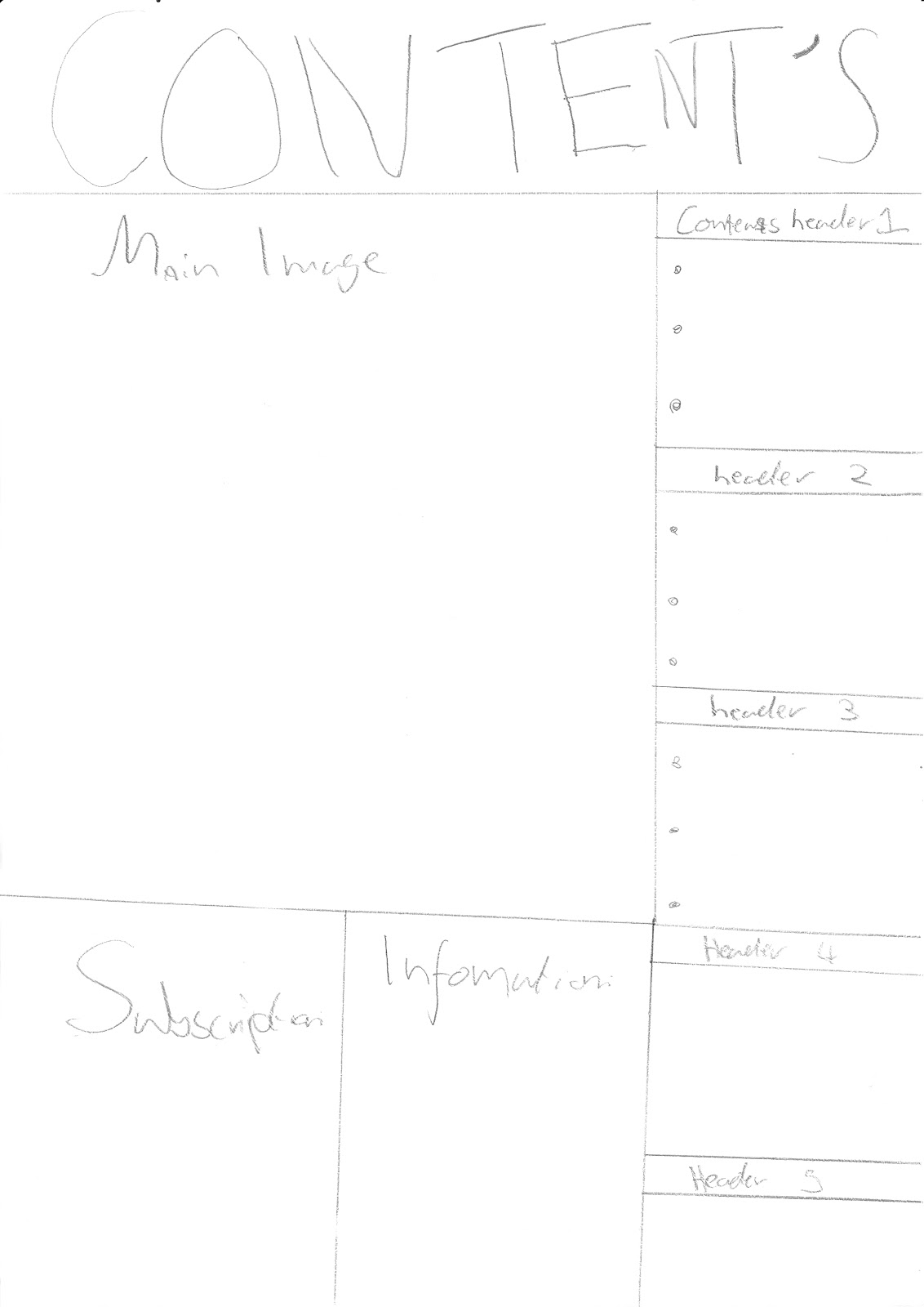
The same font is used throughout the contents page,
uses small pictures and banners to split the text into categories
guided tour informs you more on the categories available

Monday 12 September 2011

Breief; Print

Prelim
Using DTP and an image manipulation programme, produce the front page of a new school/college magazine featuring a  photograph of a student in a medium close up, plus some appropriately  laid-out text and a masthead. Additionally you must produce a mock up of the layout of the contents page to demonstrate your grasp on DTP

Main Task
the front page, contents, and double page spread of a new music magazine.
a minimum of 4 images must be used. All images and graphics must be produced by the candidate.