welcome

welcome to my as foundation portfolio blog. Here you will find research and planning, construction evidence and evaluation for my coursework project

Tuesday, 21 February 2012

Article Draft

Up and coming new artists ben and franco who call themeselves TWO-PAK are talking to us about how there lives have changed since there debut single which went staright to number one in the uk charts. Also they will be giving us an insite on what they have planned for the future.

What intrigues me is your name, “TWO-PAK”, what made you choose a name like this?

Ben- Well me and Franco both were inspired by Tupac so we had to have something to do with him in our name.
Franco- Yes i agree with ben, but also we needed something that would would show that there is two of as and we were close so all though the name may sound the same it is spelt differently with our own twist.

How has your lives changed since your number 1 hit earlyier this year?

Franco- Well for a start we bought a flat in the heart of Newcastle which we needed as we both still lived with our parents! I bought a new wardrobe and the rest of my money is being saved and will be put to good use in the future i hope.

 Ben- The flat is great, just what i needed as i get to spend more time with my bestriend and the freedom is brilliant. I also bought myself a new wardrobe but the best thing of all is seeing fans in the street wanting our autographs, it just makes the hard work worth it!

What is your track about and whats with the name “Always Last?

Franco- Well for me espeically  i was last in everything at school, pe, all my classes you name it i was last so me and Ben wrote this song which brings back many sad memorys to me but as a tune it sound sublime. We made sure that the song could be a message that even if you are last at everything to never give up hope because i didnt.

Ben- yes thes song we wrote was just unbelevable, i was so imprest! The message is strong but the song by itself is a catch song with lots of rthmyes, some may say its cheesey but we say its class. The song title, we needed something that was different that sounded to to great but that was also catchy.

Constructing my front cover

Monday, 20 February 2012

Researching and planning feedback

The feedback that has been given is that my block needs to be rearranged so it is in order, need to go over my flat plans in pen so the are clear to see. Just need to finish some minor things and make thinks a bit more detailed and i should be okay. it is all positive feedback and should be done very soon.

Action Plan

There are 6 weeks until the Easter break which means - 6 weeks of lesson time to complete my foundation portfolio.

There are 60 marks available for construction and 20 marks for Research and Planning and 20 marks for evaluation - 100 marks in total

To achieve a grade:

A I need to get 80 marks

B I need to get 70 marks

C I need to get 60 marks


To be in level 4 (grade A/B) my work must demonstrate excellence throughout.

By Monday 5th March I should have a rough cut of my products

By Monday 19th March my products should be completed

From Monday 19th - Friday 30th March I will be working on my 7 evaluation questions.

The my completed portfolio should be submitted for formal marking on Monday 16th April. I should use the Easter break to make any minor amendments to my work.

In order to meet these deadlines I will:


In the next two weeks i will be taking my photos for my magazine cover,contents and double page spread. i will be also writing my article and get that done. i will be looking back on my plans and the feedback that i have been given to make my actual magazine a lot better than my mock. 

Monday, 13 February 2012

Peer assessment of flat plan and ideas

Peer Feedback - My magazine is up to a standard of which is good, apart from the front cover. The contents page is  simple but still looks professional which is good. the double page spread is easy to understand and the whole page for a image just makes the reading that much better.


Improvements - The main improvements that I need to make is on my front cover, i have completely changed it as it was a difficult genre to do. It probably wouldn't look professional enough so i decided to change it to a modern style with blues and whites. Simplicity is the key so it is easier to understand and read.

Friday, 10 February 2012

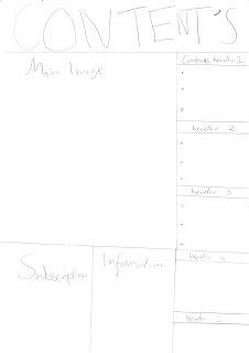
Flat Plans


These are my original flat plans. i was planning to make a magazine on Reggie/hip hop music, as it was different and there could be a lot of things that i could do with the magazine. On my front cover i was going to set the colour scheme as red,yellow and green. the main image would be a close of a man wearing a rasta hat with a dark grey background. It would consist of sell lines which would draw the reader in and purchase the magazine. The magazines name was Yeah Man which i thought was suitable for the genre of the magazine.
The contents is a simple layout, it is easy to navigate and is pretty detailed. The colours would be carried on from the front cover and maybe a dark background with light text. The double page spread is a simple set out and gives you the right amount of information without getting to much. One page as an imag the other holding the text. simple colours red, green and yellow.

Costume, Props & Make-Up

 The images I have chose are very similar and this is inspirational to me and my magazine as they both look very smart and that tells the audience a lot about a person who cares about the appearance.

Jay-Z is wearing a suit with a bow tie, the things about this that you find people of his calibre wearing is that they wear the current things that are in fashion. Also wearing his ray-bands and what looks to be white gold/ platinum watch.

The main prop in this image is the ear piece, if this was used on a magazine you would think it would be taken while he is preforming which would make the image even better.

This image looks like there is no or little make-up on Jay-Z which i think makes the image that much better it makes it seem real and that you are not hiding behind a layers. 


Kanye West is wearing a smart suit jacket with a bright read heart on the left side. This image looks like it has been taken for a certain day or magazine. He is also wearing his glasses which shows that people can look cool.

The main prop in this image is the red heart fastened in to his suit jacket. this is a very good prop as it is outstanding and it is the first thing you see on that image.

This model looks like he has been air brushed which i think makes the image look too fake. The more natural the person the more personality is shown.


From both these images i have came to a conclusion that a smart dress code and no or little make-up as possible would be suitable for my magazine. I want the images to look as real to the audience as possible.

Model Release Forms

These forms allow me to take pictures of my models and they are allowed to be placed on the world wide web. They basically are confirmation that the are okay with that happening. The shot date has not been added as i need to organise when people are capable of meeting up but it will be filled in at a later date.

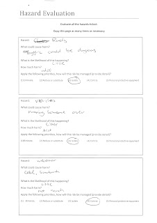
Recce of Location/ Risk & Assessments


Brick Wall - This is a photo of a brick wall which I will be using for the background of one of my photo's. This will create more effect in the image and make it look overall better. Also to give the audience somethiong differnt than just a studio


Studio - This is a photo of the studio. The studio is most likely where I will take the photo for the front cover. I will use the lights in the studio to create a professional photo. This will make my magazine look the part.

Flat Plans Second Draft


This is my second draft, the only thing i have changed is my contents page as i and the people i asked came to a conclusion that it would be quite difficult to make a magazine based around reggie music. So now it is called BUZZZ, hopefully the name and the images will attract people to my magazine. the colour scheme has changed to a bluey white colour which should still be vibrant. the contents and  the double page spread have stayed the same as there could be improvments but for me simplicity seems so much better.

Wednesday, 8 February 2012

Test Shots


 Test Shot 1- This is a test shot in a studio with the lighting that had been set for the photograph. It is a portrait and it was taken using the grid on the camera to get the models head in the top third of the image. Also he is wearing casual clothes to show that he is a relaxed person.


Test Shot 1- This test shot is a medium close up of my model, I used the grid on the camera to position the shot. I made the model appear on the left hand side of the photo and their eye line is in the upper third. These test shots were taken in the studio.

Friday, 3 February 2012

Planning an Article

In my article I am planning to use second person as this will involve and engage the reader and build up a positive relationship between the reader and the writer. Also writing in second person will put both the reader and write on an equal tenor. The language I am planning to use is going to be colloquial, so it is easy and fun to read. I will probably use the odd abbreviation to keep the language aimed at my target audience but wont do it excessively to make sure I keep formality in my article.

Wednesday, 1 February 2012

Researching Images and Composition

In the first image it is a medium close-up of jay-z. His eye line is in the top third and is in the centre of the image. The expression that he is doing is like "look at me" also with his hands in his pockets, it seems a bit smug. The mise-en-scene are his props, his chains which look like they are either white gold or platinum which shows his wealth. the plain background just shows that he is the focal point of the image and nothing else.
In the second image it is a close-up of Rihanna. Her eye line is in the top third of the image and is abit more to the right. Her pose it to show off her new tattoo as she looks over her shoulder. The lighting is from the camera and this helps with her being the focal point.